Apple Offers Safari Design Choices in iOS 26, Learning from Past Criticism
Apple introduced a new, compact design for Safari in iOS 26 that serves as the default layout, but there are two other design options available if you don’t like it.
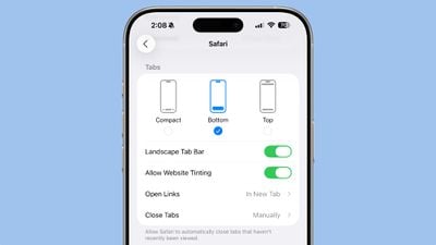
In the Safari section of the Settings app, you can select Compact (the default), Bottom, or Top. The latter two are the options in iOS 18, so iOS 26 uses that same layout, but with a tweaked design to match the Liquid Glass aesthetic.
 The three Safari Tab options in iOS 26, Light Mode
Functionally, the Bottom and Top Tabs operate in the same way as the Safari Tab bars in iOS 18, so you don’t need to change anything about how you use Safari. The Compact option hides the share, bookmark, and tab settings behind the three-dot button on the left of the URL bar.
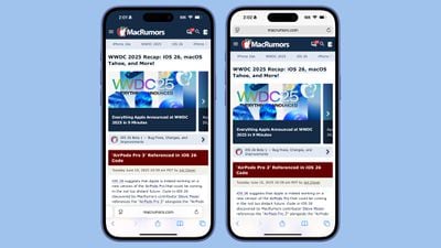 Safari in iOS 18
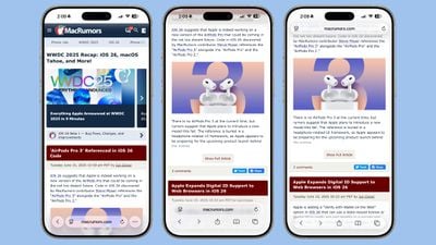
The Liquid Glass translucent design blends the URL bar and buttons into the background of the webpage you’re looking at regardless of what layout you choose. The effect is similar in both Light and Dark mode, with the color of the bar determined by the webpage’s content.
 The three Safari Tab options in iOS 26, Dark Mode
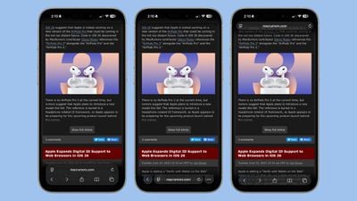
When you scroll down with any of the Tab settings, the URL bar and buttons collapse down into a single, small bar with just the webpage address listed. The collapsible bar allows you to see more of the webpage without distractions.
 Collapsed Tab Bar in iOS 26
Back when iOS 15 was in beta testing, Apple changed the design of Safari and did not initially provide different layout options for the URL bar. Apple received negative feedback throughout the beta testing process, and ultimately implemented options to revert to the original design. This time around, Apple has learned its lesson, and has provided users with more choice for the Safari layout.
 The iOS 15 Safari Tab Bar
Apple has actually offered design choices for several of the iOS 26 design updates that could be controversial. The Phone app offers a unified view, for example, but by default, it’s not implemented. There are also glass-like icons that can be selected, but they’re also not the default option.
Comments are closed.